
Funnel Traffic Graph On My Dashboard
Learn what the Funnel Traffic Graph displays
Written by ConversionFly HelpLast update 5 years ago
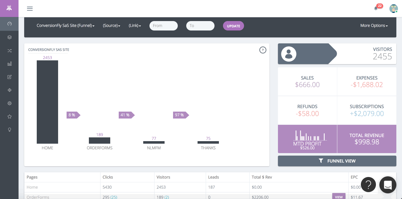
The Funnel Traffic Graph featured on dashboard shows a bar graph with information on the number of visitors you have received on each page.
The purple arrows indicate what your traffic conversion percentage from page to page is.
A great use of this graph is to analyze traffic based bottlenecks in your funnel.
You can filter the funnel you are viewing, the date range, your sources, and your links in this graph by using the top menu bar.
Did this answer your question?